Live Brief:
I was asked by a group of Fine Art students to create branding and promotional material for their exhibition called Apparent Matter. The group use a range of materials textures, so the design should be suitable for each artist.
I was asked by a group of Fine Art students to create branding and promotional material for their exhibition called Apparent Matter. The group use a range of materials textures, so the design should be suitable for each artist.
Outcome:
I found that the one main feature of the varying styles seemed to be colour, so I focused the logo icon on being a colour palette to fit each artist. I also combined the idea of states of matter and the collective group as the paint holders on the palette, producing a strong visual metaphor. For the word mark I changed some of the letters to be more hand drawn, in which the contrast in style connotes the varying techniques used by each artist, as well as the handmade aspect of the art.
I found that the one main feature of the varying styles seemed to be colour, so I focused the logo icon on being a colour palette to fit each artist. I also combined the idea of states of matter and the collective group as the paint holders on the palette, producing a strong visual metaphor. For the word mark I changed some of the letters to be more hand drawn, in which the contrast in style connotes the varying techniques used by each artist, as well as the handmade aspect of the art.
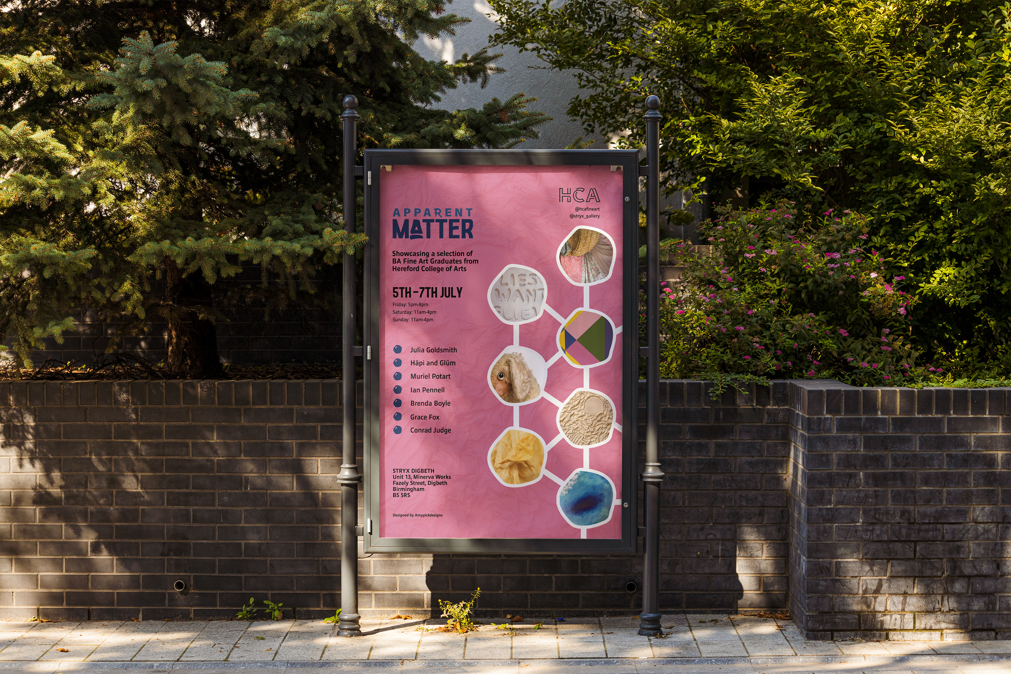
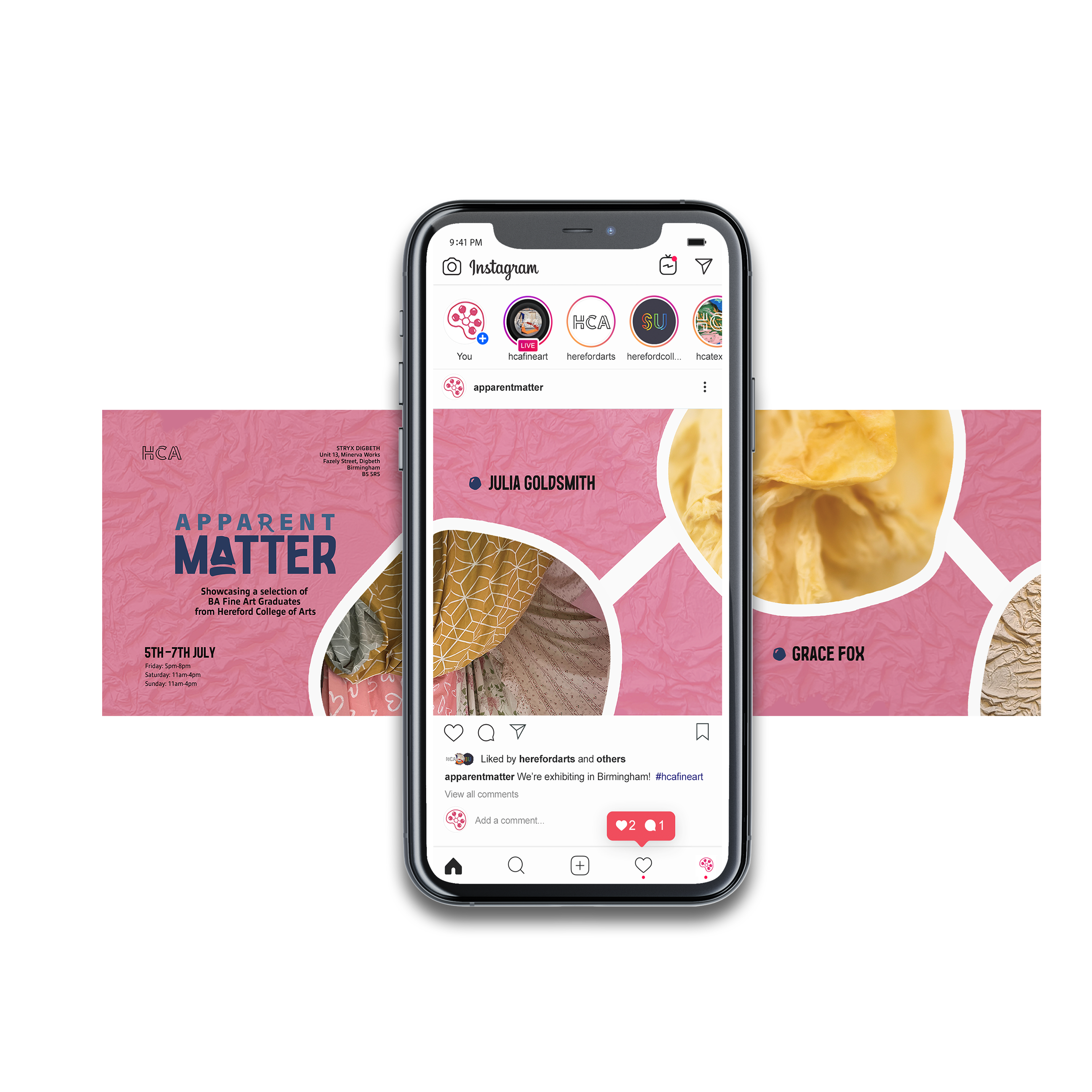
The success of the branding resulted in the collective asking me to create an accompanying poster and Instagram posts for their promotional material. Using the texture from one of the pieces I created an overlay for the background to create a sense of depth and to signify the creativity of the exhibition work. I used the circles from the logo to place close up images in to give the viewer a sneak peak at what work will be on display, as well as to connote that they are all a part of a collective.
